Computers have become the lifeblood of our society. Computers are responsible for so much, from making sure that you get your money when you want it, to handling long-distance calls to providing hours of entertainment. Computer science professionals are what make everything run smoothly. Working closely with computers provides some interesting insights into the world of computing. However, you don’t have to have a Master’s in computer science in order to be a computer nerd. Here are 21 infographics that any computer nerd can appreciate.
Computers
These infographics offer an interesting look at computers in general, and their usage.
 Mousepath: This is a great app that actually lets you build your own infographic. Interactive and designed by Anatoly Zenkov, you can track the way you use your mouse throughout the day. This app is available for PC or for Mac. All you have to do is run the app at the beginning of the day, and then minimize it to get it out of your way. Use your computer and mouse as usual. At the end of the day, you will have a custom infographic that shows the path followed by your mouse. A fun way to create a bit of abstract expressionist art of your very own. You can tell everyone it’s a Jackson Pollock.
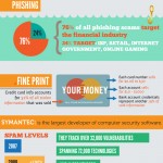 Computer Threats: Ever wondered about how many computer threats are really out there? You can see a breakdown of all of the active computer viruses, trojans and worms active in one year as compared to 2002. You can see how widespread computer threats have become. Also includes the costs of data breaches to the economy, and where malicious code comes from. This infographic also addresses phishing scams, and spam. It’s an interesting look at computer security, and how vulnerable many people are. Identify the threats that might affect you (or someone you know), and prepare yourself against them.
 Environmental Impact of Computing: If you are environmentally minded, you might be interested in this infographic, which shows the impact of computing. It includes information on how many new computers will be sold each year, and the types of resources that go into manufacturing computers. Also see how many computers are in use around the world (1 billion), and how much energy all of that uses. You might be surprised at what computing is doing to the environment. An eye-opening look at the impact of computers, and how they might be affecting the environment.
 Hype Cycle of Computer-Interface Design: We all like to get excited about new technologies — especially when it comes to the computer and new interface designs. We all want the coolest features, from fabric sensors to handwriting recognition to health monitoring. While some things come to be, others will not be realized for years. If they ever are.
Operating Systems
Look at the facts surrounding different operating systems in inforgraphic form.
 Linux Kernel Zoomable Map: This is an awesome infographic that shows the way the Linux operating system kernel works. Colorful, and zoomable, this infographic is quite useful. It is a top down view of kernel, showing calls, modules, functions, functionalities, layers and more. Just about everything vital about Linux. If you want to see better details, you can zoom in. Everything on this map is verifiable, as there are hypertext links that send you to documentation or actual source code. You can use this as a reference, or just as a cool tool to play around with for a while. A great resource.
 OS X Snow Leopard vs. Windows 7: The Onion pleases with this great, funny infographic comparing the Mac OS X Snow Leopard system with Windows 7. A funny comparison that includes the ability to run Snood and porn at the same time, as well as a comparison of the built-in audience for each system. Also includes the problems meant to solve (such as “chumps with too-much-money syndrome” and “chumps who thought things would be better this time around”). If you want to take a few minutes to have a good laugh — and then congratulate yourself for running Unix — this is the infographic for you.
 Should You Buy an Ipad?: This infographic offers a fun flowchart that can help you determine whether or not you should buy an Ipad. Looks at some of the things the Ipad does, and offers, below, a second infographic detailing all the specs of the Ipad. It looks at average cost of apps, as compared to the iPhone, considers point scale, and estimates device cannibalization. The two infographics together should offer you everything you need to know about the iPad. And let you decide whether to get one, or to wait until Google releases a tablet running Android, as the company is rumored to be planning.
 Cell Phone Operating Systems: Interesting look at cell phone operating systems, and what is most popular. The global market share of different cell phone operating systems can be clearly seen. Some, especially in the U.S., might find it interesting that Symbian is the most used mobile phone OS in the world. Its popularity in Africa and Asia is one of the big reasons that it is ahead of the Blackberry and the iPhone. An interesting infographic that puts smart phone operating systems into perspective.
Social Media
The rise of social media is the subject of many an infographic. A look at the way we interact online.
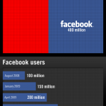 The United States of Facebook: What’s the third largest country by population? Facebook, of course! With more than 400 million users, the only countries in the world with more people than Facebook has users are China and India. This infographic also charts the explosive growth of Facebook, and shows a handy comparison between Facebook and countries such as the United States, Russia, Japan, Germany and the U.K. Also projects how many users will be on Facebook (630 million) if the population continues to grow at the same rate. That’s pretty crazy. Maybe one day Facebook will even surpass China.
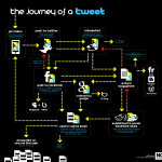 The Journey of a Tweet: Learn how a tweet makes its way from its source to various places on the Web. It’s not just about tweeting on Twitter. This infographic shows how the tweet can then travel all around the Interwebs, with stops at Facebook, Flickr (if it’s a picture), WordPress, and social bookmarking sites like Delicious, Digg, Stumble Upon and Reddit. Follow the various paths a tweet can take as it heads toward immortality as a bit of Web wisdom. Also includes how a tweet can be indexed by Google and used in office emails and how it can go viral all over the Internet.
 Profile of a Twitter User: This is a fun infographic that looks at the basic types of Twitter users. It also teaches you how to deal with different types of Twitter users. For example, you should understand the Newbie, and blog the B1tch. It is also important to be aware of different types of Twitterers, from Brands to Mavens. Who you follow can influence and provide you with helpful insight. This infographic is a fun way to learn what you can about the Twitterati, and even figure out what kind of Twitter user you are. (Hint: You want to be a Mensch, but you’re probably a Smore.)
 The CMO’s Guide to The Social Landscape: Simple and straightforward, this infographic offers you a look at the social media landscape — with the most important sites listed. No obscure sites here. Anyone can get an instantly recognizable overview of the main social media sites, and the best ways to drive traffic to your web site. Looks at ways that you can enhance customer communication, build your brand and do other things using social media. This is a helpful guide for anyone who is interested in targeting social media for use in driving traffic to a web site — even if you aren’t a CMO.
 Facebook Privacy Infographic: Another Facebook infographic, this one addresses privacy. Every dedicated computer nerd knows that Facebook is a privacy nightmare. And here’s the infographic that shows it in all its glory. Learn about how you have to navigate more than 170 options in 50 settings in order to get the security you are looking for. Perhaps there is no such thing as true privacy once you get online, but Facebook isn’t helping matters.
Internet
Interesting infographics about the Internet, and how it is used, and browsers.
 A Day in the Internet: We don’t really think about the vastness of the Internet, and all of the information available online. However, there is a ton of information online. This infographic puts the size and scope of the Internet into perspective, with some startling facts, such as the stat that more than 210 billion emails are sent daily, and that you could fill 1.7 million Blu-ray discs with the amount of information sent every day via mobile phones. It’s astounding how much information is out there, and how much of it is sent all over the world on a daily basis. The Internet truly is one of the world’s great wonders.
 If Browsers Were Girls/Women: An irreverent look at Internet browsers. What if browsers were women? Well, Opera would be sexy and tough: Awesome for those who can handle it such a sassy babe. Internet Explorer would be kind of cheap (and maybe dangerous). Firefox would be just what you were looking for, full of goodness and fun. Chrome is skinny and inexperienced. It’s an interesting comparison of Internet browsers, and an fun way to think about them. It’s surprisingly accurate as well. Now, if you could just stop surfing the Internet, and go meet a girl…
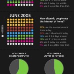 State of the Internet: Get a good look at Internet usage with this infographic. It offers an overview of the Internet in 2009, showing Internet use across different demographic groups. It’s probably not surprising that age group 18-29 uses the Internet the most. Additionally, the infographic addresses broadband access by income level, as well as Internet use by education level. College grads use the Internet the most — which isn’t particularly surprising. If you are interested in how often people use the Internet, and other facts about the Interwebs, this infographic is a cool resource.
 Internet Traffic: Look at Internet traffic around the world. See where the most users are, and see the percentage of the population that uses the Internet. China constitutes 17% of the world’s Internet users, which is not much of a surprise since China has such a large population. The U.S. is the second largest source of Internet traffic.
MMORPG
If you’re into creating a whole new life, then there are plenty of MMORPGs out there for you. And infographics about them!
 The Unbelievable World of Warcraft: Everything you could possibly want to know about the people who play World of Warcraft. Offers an account of the popular races chosen as characters (I was surprised to learn that humans surpass elves). It also includes a look at which continents subscribe to WoW the most, as well as average hours spent playing WoW in America. You can even get stats on female WoW subscribers, as well as quests completed and auctions participated in. See pictures of celebrity WoW players as well. No, you’re not alone. McCauley Caulkin likes to play World of Warcraft as well. Maybe you’ll run into him online.
 Who’s Playing EverQuest?: What sort of person plays EverQuest II? Someone actually set out to discover the answer to this question. The result is this infographic detailing the type of person actually playing this MMORPG. One of the most surprising bits of information is that the majority of players are between the ages of 30 and 30. Also, EverQuest players exhibit a higher level of depression than the average American. This is interesting as well. This infographic also contains the information that EverQuest players experience less obesity than average for Americans. Do you play EveryQuest? Do you fit the profile?
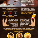 Things You (Probably) Knew About Star Trek: Star Trek has its own MMORPG, so you can search the galaxy and have a good time with other Trekkies. This cool Infographic offers things you probably already know about Star Trek. But it offers a good reminder nevertheless. Information such as the incidence of the first inter-racial kiss on TV is old hat to most Trekkies. And, of course, many a geek laughs at the fact that Zachary Quinto had to glue his hands together to do the Vulcan salute. But did you know that in the original series, the pilot had a woman as first officer? And there is actually a college class on the anthropology of alien languages — including a look at the evolution of the Tribble language.
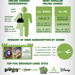 Online Gaming Stats: This infographic probably won’t come as a surprise, but it’s informational nonetheless. It looks at the size of the online gaming market ($15 billion), and looks at how many players are online. PS 3 users trail behind Xbox 360 in terms of hours played per week. Looks at other essential stats, such as gender, income, popular games and more.